Showing posts with label watercolor. Show all posts

Love Rococo Rose


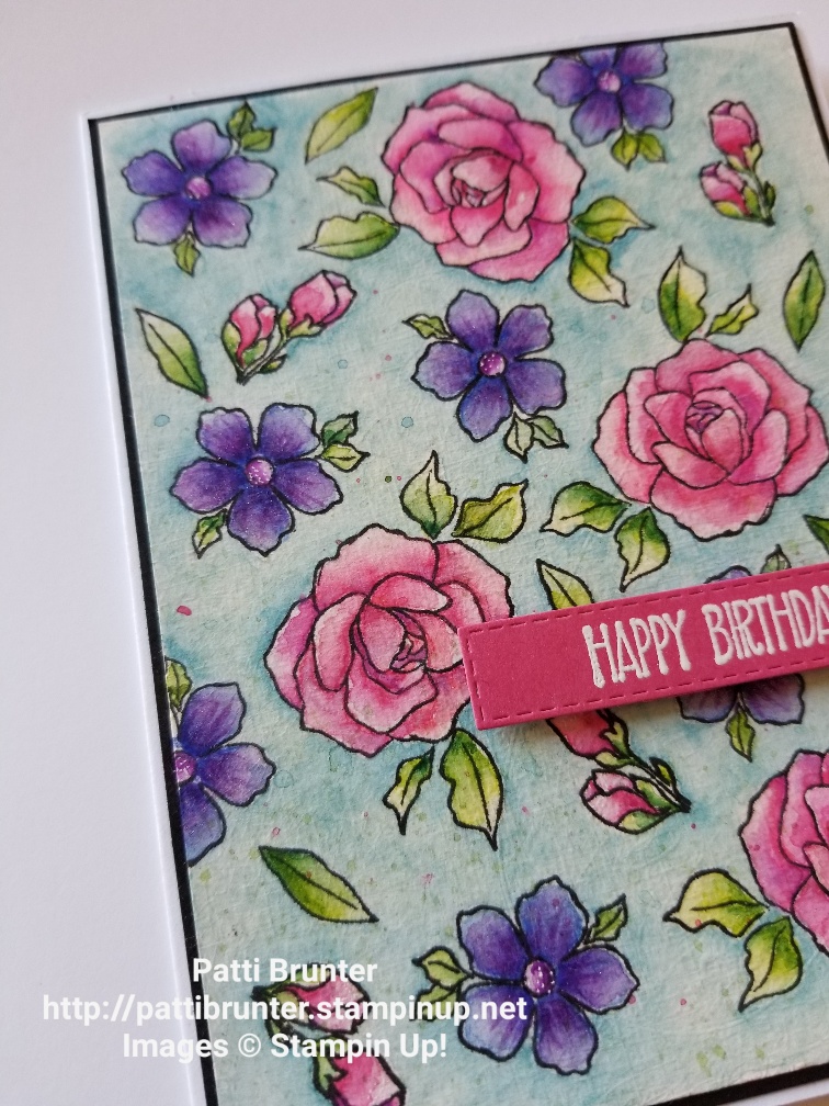
I am in love with the new in color rococo rose!  So I couldn't resist using it for the flowers in this background. After I made this card I realized that I made a card very similar a while back. I stamped the flower image from the inspiring iris stamp set. I taped the paper down because I knew that I would be using a lot of water and wanted it to be flat. It really does make a difference when you go to make the card when the watercolor paper is flat.  Since it is so thick it has a tendency to warp the whole card!


I wet the entire paper and then dropped in ink color with my aquapainter, using rococo rose, mambo melon, daffodil delight and grapefruit grove for the flowers. For the leaves I used granny apple green and old olive. I waited for this to dry completely and then did another layer of color. Then I added the small flower with seaside spray and daffodil. I didn't want that to bright and so I blotted it to make it very light. Then a few splatters of color and I was done.


The greeting was white heat embossed and punched out with the pretty label. I am also super obsessed with the new woven threads sequins assortment.  The colors are beautiful! Enjoy!


Purple Power


This card is a whole lot of purple!  I had colored the iris image and wanted to use the purple in the background. To make the background I took a piece of water color paper and after taping it down completely covered it with water. I then added highland heather and gorgeous grape alternating the rows of color. I also tilted the paper a little to try and get the colors to run into each other. 


The color was a little strong for me and I wanted to add some extra texture and so I decided to use the pinewood planks embossing folder. 


The stamps I used are from the inspiring iris stamp set. I decided to color the outline stamps with stampin blends. I hope you get some new ideas from this card and create a purple masterpiece of your own. Enjoy!

Inspiring Iris

Wow is this set beautiful!  The possibilities are endless with it and I am so excited to share this card with you today. This card I CASED from the new Stampin' Up catalog page 124. It is an amazing resource for ideas and creative inspiration! I just changed the stamp set and colors and made it my own.


I started with a piece of watercolor paper and white heat embossed the outline of the iris's. I thought that rather than using the stamp to color them in I would watercolor them. (This set comes with stamps that fill in the colors for the stem, leaves and flowers) I did a quick watercolor on the entire panel with a messy look (not staying in the lines). I like the way that this came out. I am still trying to become better at my watercoloring and I know that it takes lots of practice!


I also looked up iris colors online to see what colors I wanted to use.  This is also a great resource for when coloring. It is fun to see all the color combinations and variety.  For this panel I decided to keep with the traditional iris colors. I stamped the solid stamp with versamark ink on the pear pizzazz card front. The new stitched nested label dies were calling my name. I have been wanting to give them a try and so I decided to use just the top half to frame my iris painting.


The card that I was looking at in the catalog had the sentiment in a straight line and so I stamped this greeting each line separate and carefully lining up using my grid paper. The piece of gingham paper is from the neutral designer series paper. I love the new designs! I also added a few of the new woven thread sequins for a little sparkle and some wink of stella on the iris flowers (however it is hard to see in the photos). Give this set a try and if you need a demonstrator (and don't have one) I would love to order this set for you! I think you will have lots of fun with it!

You are somebody!


Hello! I hope you are having a great day!  Summer is here and I could not help making a card with some nice bright colors. The colors I used were granny apple green,rich razzleberry and balmy blue. I really like this stamp from the inspiring iris stamp set, I thought that I could use it as a background and so I white heat embossed it several times. 


When I was making this card I realized it looked like Easter. 


To the sentiment I used the stitched shapes and I highlighted certain words with blender and ink,  I did not want the paper to get very wet since I had put it on regular white card stock and not watercolor paper. Try using one of the stamps from a set repeatedly and have fun!  I really had fun making this card and I hope you like it.  Enjoy! 

Beautiful days!


Hello and welcome to my blog! If you are new to my blog I invite you to leave a comment! I would love to hear from you and what you think of my cards and my blog. For the card today I have been practicing my watercoloring again. I am currently doing the 30 day coloring challenge started by Kathy over at the daily marker website. She is an amazing colorist and I have learned so much from her. I have always loved to color and what a wonderful thing to give my self permission to color each day. It doesn't have to be for a long time but enough to relax and enjoy the process. Sometimes I find that I am hard on my myself and compare my work to others and so I am really trying to enjoy the process and relax and color. For this project gold heat embossed one of the flowers from the  perennial essence bundle.


I gave the old school try on the watercoloring of the images. I know that I need a lot more practice and I am learning so much from the experience. I think I got a little too dark with the colors and needed a little more highlighted areas to really make this flower pop. I tried adding some white highlights with a gel pen but I am not sure that it really helped.


The sentiments in this set are beautiful! I gold heat embossed the one that I thought looked best to fit on this card. Let me know what you think about the watercoloring of my flower. I would love to have all the input possible to help me grow in my watercoloring. Thank you so much for visiting and have a great day! Enjoy!

Water color petals


This will have to be quick post for today. I am still enjoying my "coloring time" and wanted to share my card for today. I started by silver heat embossing the petals from the perennial essence bundle. This bundle comes with a great punch that coordinates with this stamp. I made 2 sets of petals to stack for a 3D effect. I water colored the petals and I really like the colors and how they blended. It made the most beautiful color!


I used the stitched label die to cut out a base for my sentiment and continued the silver heat embossing. I was afraid that you would not be able to read the greeting but I was pleasantly surprised that it showed up nicely!


I did not want to leave the background completely white and so I sponged on some balmy blue with my brick looking stencil. I thought turning it sideways would give it a different look and I was very happy with that but after putting the card together I decided that I think it would have looked better if I used a soft green in the background. I think the blue just didn't really go well with the rest of the design. Have a beautiful day! Enjoy!

Bird at the beach

I hesitate to post this card. I am not really sure that I like the way that it turned out, but then I thought maybe someone would see it and could tell me how I could have made it better. So I would love any comments you would have!


I stamped the scene with versamark and then white heat embossed the entire thing. I then attempted to watercolor the picture. That is what I am not too fond of. I think that the watercoloring it a little flat and I don't know where it went wrong.  I tried to go in with some watercolor pencils to add some contrast. I think that helped a little bit but still not my best work.


Please give me advice on what you think. Also, note that my sailboats are stamped crooked and I tried to work with that as well.  I was not gonna give up on this card.  I think that it is a great idea to post cards that we don't think are our best. What do you think? So maybe someone out there but like this card, or maybe not. But it is what I produced today and I know that I learned things in the process and most important just enjoyed the time I spent creating! Isn't that why we do art? Have a fabulous day and go create your own work of art, whatever that may be. Enjoy!


Serene watercolor

Do you feel like watercoloring is calming? I sure do.  Even if it isn't turning out the way I had planned I really enjoy the process of watching what the colors do with the water.


For this card I white heat embossed the images and used my ink refills for the color. I used watercolor paper because I knew that I would be using a lot of water.  One of the most amazing things about watercolor is seeing what the color does when you add a few colors. The blend that it creates is always so interesting to me. 


The serene garden bundle will be retiring at the end of May and so if you would like to order it please let me know. I think it has some really beautiful images! Have a beautiful day! Enjoy!


Amazing!


Well I am still trying that watercolor thing.  I see so many wonderful artist out there who make it look so easy.  The one thing that they all keep saying is to keep practicing and so that is what I have been doing. Hopefully you wont get to tired of seeing all my attempts at making it better.  For this card I white heat embossed the serene garden large stamp and the butterfly. I used my aquapainter and my ink refills for the watercoloring. It is much easier to watercolor when you have the white embossed area, the colors to not bleed. I was trying to use a few different colors in most images and also tried not to make it to exact. I used the balmy blue for the background color and then lots of splatter.  Make sure to let your painting dry before adding the splatter or it will just blend into the other wet areas.


Here is a close up of the watercoloring. Let me know what you think. I would love all criticism because I would like to improve in any way that I can.  The "amazing" is from the celebrate you thinlits, also sad to see that retire as well. Let me know if you have tried watercoloring and how that is going for you. Have a wonderful day and enjoy! 


CASE card

Have you heard people in the card making community talking about CASE a card and wonder what it means? Well it stands for Copy And Share Everything. Well at least that is what I have always put together with the letters. (hopefully it is right and I am not giving you the wrong info) Anyway I find that when I am in a slump and trying to make a card and have no creative juices flowing to pull out my stampin' up catalog and copy. I like to find a layout that I like and then find a set that I have that I can use. One thing that I think is important with this way of stamping is give credit where credit it due. I would not use an ideas or copy a layout or card without giving the first artist credit. I feel like that is just the kind thing to do.


This card is an example of CASE. I used the card example on page 59 of the Stampin' Up annual catalog for my inspiration.  The artist for SU have so many wonderful samples in their catalog so why not take advantage of using the ideas. I used daffodil delight and calypso coral for the background on watercolor paper for a quick wash of color. I then stamped the images from the high tide stamp set in black ink. I used a stamp positioner for this process because I find it hard to get a nice crisp edge on watercolor paper due to the texture. So with the positioner I am able to stamp the image multiple times. I also liked the way that the artist in the card in the catalog kept the scene going on to the card base and so I also used that idea in my card.


I hope that the next time that you are having a hard time trying to make a card you use one of the many beautiful samples in one of the SU catalogs. I have every catalog since I started stamping and reference back to them frequently.  Have a beautiful day!


Color Therapy


Hi Everyone! As I have said before, I love to color! There are so many ways I love to color! I find it so therapeutic. I love to stamp many images on Stampin' Up thick white cardstock with the momento ink and then color away. It is also nice because then I can take it with me to appointments or even just to sit and watch tv.  The only problem is then I have so many images that I have to make into cards. The problem would be I might color 10 of one thing and then I make lots of the same cards. So just to beware I may have lots of baby cards on my blog. I just think the babies are so cute and really fun to color! 

For this card, I wanted to use many of the other images from the stamp set. I also had an oval shaped watercolor paper that I had created a yellow watercolor wash on from another project that I did not use. I thought it would be a good background for the baby in the jumper.


Here is a close up of the coloring on the baby. One thing that I would recommend is to wait to cut the images out after you have colored them. It makes it so much easy than having lots of little pieces around, especially the little bottle that you see in the above photo. I also like that this bundle has framelits that cut the majority of the images out. Makes life so nice!  I hope you can find some time to color this week!  I know that I will and stay tuned to more baby cards!

Birthday watercolor


 Today I have been practicing my watercoloring.  From everything that I have seen or watched online, I have learned that to be a better watercolorer I have to practice.  It is very difficult to figure out the amount of water that is needed to get the effect that I would like to achieve. I have been having so much fun with this medium.  For the card above I used watercolor paper and stamped my flower images with Staz on ink because it will not run when water is applied. I randomly stamped the flowers from the tea together stamp set. I layered the colors that I used, letting them dry in between each of the layers.  This is very important so that you get a layer, if you apply more color when the image is wet the colors will bleed into each other.


 I went in with a wash of balmy blue for the background.  I wanted to keep the background pretty neutral so that the flowers would stand out. I love to color my flowers bright and bold as I am sure you can tell from this painting.  Since the background is so busy and I decided to go with a simple greeting for the card. I hope you try watercoloring with the aquabrush and some of the dye inks. It really is fun and relaxing.  Let me know if you have any other questions.  Have a beautiful day!


Glad we are friends!

Hello everyone! I am trying a new size for my photos.  What do you think? Is it too big?  I know when I look at other peoples blogs I like a big picture so that I can see the card up close and so I thought maybe I needed mine a little bigger.  

I ordered the incredible like you stamp set and kit. I loved the colors for this kit and they were even better in person.  This kit was really fun to put together, it is a little more challenging than some of the kits that Stampin' Up offers but the results are beautiful cards.  The stamp set is sold separately and so if you like the greetings that they used in the samples you will want to order that as well.  After making the cards in the kit I decided to play with the stamp set.  I love all the images and especially that it is a two step stamp set.  The large flower has beautiful texture and so soft looking.  I used soft colors for this card, blushing bride and soft sea foam because I wanted to give the appearance of watercolor.

This set also has many wonderful little filler stamps which are perfect for creating a meadow of flowers. I used the stripes to make my own background paper. When I stamped the stripe it did not stamp solid, but I loved the way it looked like it was distressed.  The greetings in this set are so wonderful. I love the font that they used as well as the sentiments. I know that I will use this set for so many more cards in the future.  If you would like to order this set and the kit that goes with it just go to my store and don't forget for just a few more weeks it is saleabration. For every $50 spent you can pick a saleabration item for FREE!  You will not want to miss out on that great deal!  Have a great week!

Lilypad Lake

 Can you believe that January is half over already.  Before we know it, it will be summer. This stamp set and matching framelits make me think of summer. Growing up in Minnesota there was always a lake to walk around and enjoy. The true sign of summer were lilypads on the lakes along with the beautiful duck, geese and other birds that would be in the water.  It really reminded me of my younger days in Minnesota. It brought back so many wonderful memories.

The stamp set is lilypad lake and lakeside are the name of the framelits. If you order them together you receive 10% off, what a great opportunity to save. And if you order them now during saleabration you just need to order $6 more to receive a FREE item from the saleabration catalog. 


I had a watercolor panel that I had made a while ago and it was really dark and solid. Not the colors that I wanted for the project I was working on at the time. It was perfect for this card. I used the framelit to cut wavy lines for the water and then I put pool party card stock behind it for the look of water. (I kept the wavy lines to make another card, I will share that another day)  I used the memento black in so that I could color the bird and boat images with my stampin' blends. Using the matching dies to cut these images out made it so easy.


The greetings in this set so beautiful.  Any of them would be great for an uplifting card to send to a friend or relative who is having a hard time. I think it is really important to share our cards to encourage the people in our lives. It could make their day just a little bit special. If you know of someone who needs a little happiness in their day make them a card. It doesn't have to be fancy, just a little note so they know someone cares and thought of them today. Enjoy!

Sweet Baby Boy


This little set just melts my heart. The sweet baby stamp set along with the coordinating framelits (bouncing baby framelits)  you can make this cute little blanket to swaddle your baby.  If you order the set and framelits together you receive 10% off.  The dies not only cut the shape of the blanket they also make the score lines for you. I used the neutrals (night of navy) designer series paper to make the blanket. I also like that it is double sided and so you can see both designs when folded. The rest of the card is pretty easy to follow. I used night of navy for the layer on the white base and stamped the "its a boy" in night of navy in the background. For the greeting I stamped night of navy on white and used another cute die that comes in the set as well. It makes the cute ruffle on the bottom. I just couldn't resist even though it is a boy card. The heart that I used to close the blanket is from the stitched label framelits. I have found that this framelit set goes well with the sweet baby set as well.


Here is a close up of the baby and the blanket. I water colored the little baby and the cute little bear hat.

This is a close up of the cute eyelet ruffle. I think it adds so much to the greeting and the bottle to help balance out the card.  Enjoy!

Country Home

Do you find that there are some stamp sets that when you get them you realize just how much you enjoy them?  The country home stamp set was that way for me. I thought it was adorable in the catalog and so I ordered it, come to my surprise I now can't stop using it. I love the greetings, the fonts and the images.  They are great watercolored, colored with pencils as well as stampin blends and just stamped with no color at all.  My favorite card that I made with set is the one below.


I just can't get enough of this cute milk jug! I looked online for the colors for milk jugs and I saw so many different colors that I thought why not watercolor them all different. I love the rustic feel that this portrays. The greeting fits so well on the top and my card was finished in no time.  I have been working on my watercoloring. It is not as easy as it looks.  There are so many amazing watercoloring artists online, I could watch them all day.


I have also included a close up of the milk jug.  My watercoloring is a work in progress, but I do like the way that this turned out. I used the ink refills with the aquapainter for this. Using the neutral colors and then added some splatter to add to the rustic look. I am so glad that this stamp set was carried over from the holiday catalog. I really hope you enjoy this card!

Fear Not!


Hi everyone, I hope you are all having a great day!  For the card I made today I picked the Rose Wonder Stamp Set. I am so sad that this set will no longer be available for order after May 31st. I love this large rose image.  It is really fun to color as well as because it is so large you do not have to do much else to make it into a card. The coloring options are endless. For the first card I started with a piece of the shimmery white cardstock and stamped the rose image in grey archival ink. I used my aquapainter with Stampin Up dye based ink pads to color.  For the rose I started with a light wash of daffodil delight and then when that dried I added calypso coral and a little pumpkin pie in the center where I thought the flower would be the darkest. For the leaves I used the same technique and used old olive and artichoke for the darker color. After the entire piece was completely dry I added speckles by putting some smoky slate ink on the corner of my acrylic block and then using the aquapainter to flick color from the block.  I kept the block a fairly far distance from the paper because I wanted the specks to be small. I decided I wanted to keep the card flat so that it would be easy to mail and so I made a quick watercolor wash with marina mist in the corner. I knew that I would put the sentiment there.  I stamped the sentiment on when it had dried with staz on black ink. The sentiments in this stamp set are so beautiful for when you need a card with an encouraging message. I will continue to use them for a very long time. To finish the card off I used a few of the glittery clear drops from the occasions catalog. I was really hoping they would continue to offer these in the new catalog because they really come in handy when you need a little something. But since they will be retired you will want to get them before they are gone. The entire piece is just a little smaller than standard card and I mounted it on to a piece of artichoke card stock.

For the next card I watercolored the card in a similar way however, I used watercolor paper as the base and white heat embossed the image.  Using heat embossed images makes watercoloring a little easier.  It doesn't bleed into the other areas. The background I did a very light color wash of marina mist. For the flower I used pale plum and with each layer I used a more concentrated amount of color (less water) for the leaves I used old olive, and a little bit of daffodil delight. The sentiment I stamped in staz on black ink and a few speckles of pale plum. I mounted the entire card on pale plum card stock.

I hope you enjoy these cards. Remember the retired list will only have items available until the end of May.  Many things have already sold out, so if there is something you would like make sure to get it while it is available.  If you do not have a demonstrator I would love to help you in anyway that I can.  Have a wonderful Memorial Day weekend!